Every business has something to say, to show and to offer. Generally, every product that is out there on the market is bought by someone who needs it, who are attracted by it, by the person’s feelings or wantings.
Now, how we create the right emotions with colour in web design?
Well, according to Wikipedia, in the visual arts, colour theory or colour theory is a body of practical guidance to color mixing and the visual effects of a specific colour combination.
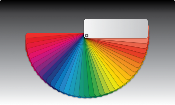
According to colour theory, harmonious color combinations use any two colors opposite each other on the color wheel, any three colors equally spaced around the colour wheel forming a triangle, or any four colours forming a rectangle (actually, two pairs of colors opposite each other). The harmonious colour combinations are called colour schemes – sometimes the term ‘colour harmonies’ is also used. Colour schemes remain harmonious regardless of the rotation angle.
If you can’t trust your own judgment, understand and rely on the basics of colour theory to always pick the right colours.
In a study titled “Impact of colour on marketing” researchers found that up to 90% of snap judgments made about products can be based on colour alone.
Our advice is to use the next steps when you think colour for your website:
- Choose the right dominant colour for your website and brand.
- Combine complementary colours to create your perfect color scheme.
- Choose a background colour that works for you.
When choosing your colours start by choosing your boldest colour, and then choose the others with the first colour in mind.
If you don’t know where to start, nowadays are lots of websites that show popular colour schemes, which you can quickly browse and easily incorporate any of the codes for your need, either to use the colour code in your logo, website or other graphic materials that are waiting to be created for your business.
Colour is such a fundamental part of the way we perceive the world that we often take it for granted.
We recommend applying Colour Theory in everyday life, either is food, clothes or business.
Red
Promotes: power, importance, youth
Orange
Promotes: friendliness, energy, uniqueness
Yellow
Promotes: happiness, enthusiasm, antiquity (darker shades)
Purple
Promotes: luxury, romance (lighter shades), mystery (darker shades)
Green
Promotes: growth, stability, financial themes, environmental themes
Blue
Promotes: calm, safety, openness (lighter shades), reliability (darker shades)
Black
Promotes: power, edginess, sophistication
White
Promotes: cleanliness, virtue, simplicity
Gray
Promotes: neutrality, formality, melancholy
Ivory
Promotes: comfort, elegance, simplicity
Beige
Promotes: traits of surrounding colors