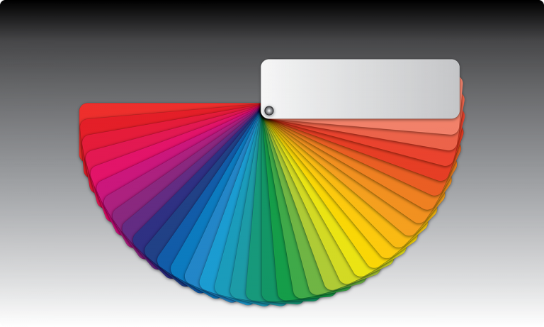
Color is one of the most powerful tools in a designer’s arsenal. It can evoke emotions, influence perceptions, and drive behavior. Understanding color psychology is essential for creating brand identities that resonate with your target audience.
The Emotional Impact of Colors
Blue conveys trust, stability, and professionalism. It’s why so many financial institutions and tech companies use it. Think PayPal, Facebook, and IBM.
Red is energetic, passionate, and attention-grabbing. It creates urgency and is often used for sale promotions and call-to-action buttons.
Green represents nature, health, and growth. It’s the go-to choice for eco-friendly brands and wellness companies.
Yellow exudes optimism and warmth. It catches the eye but should be used sparingly as it can cause visual fatigue.
Purple suggests luxury, creativity, and wisdom. Premium brands often incorporate purple to convey exclusivity.
Orange combines the energy of red with the friendliness of yellow. It’s playful and often used to appeal to younger audiences.
Cultural Considerations
Colors have different meanings across cultures. White symbolizes purity in Western cultures but represents mourning in some Eastern cultures. Always research your target market’s cultural associations with color.
Applying Color Psychology
When developing a brand identity, start by understanding your brand values and target audience. Choose a primary color that aligns with the emotions you want to evoke, then select complementary colors that create visual harmony.
At Vere Design, we carefully consider color psychology in every brand identity project to ensure your brand makes the right first impression.